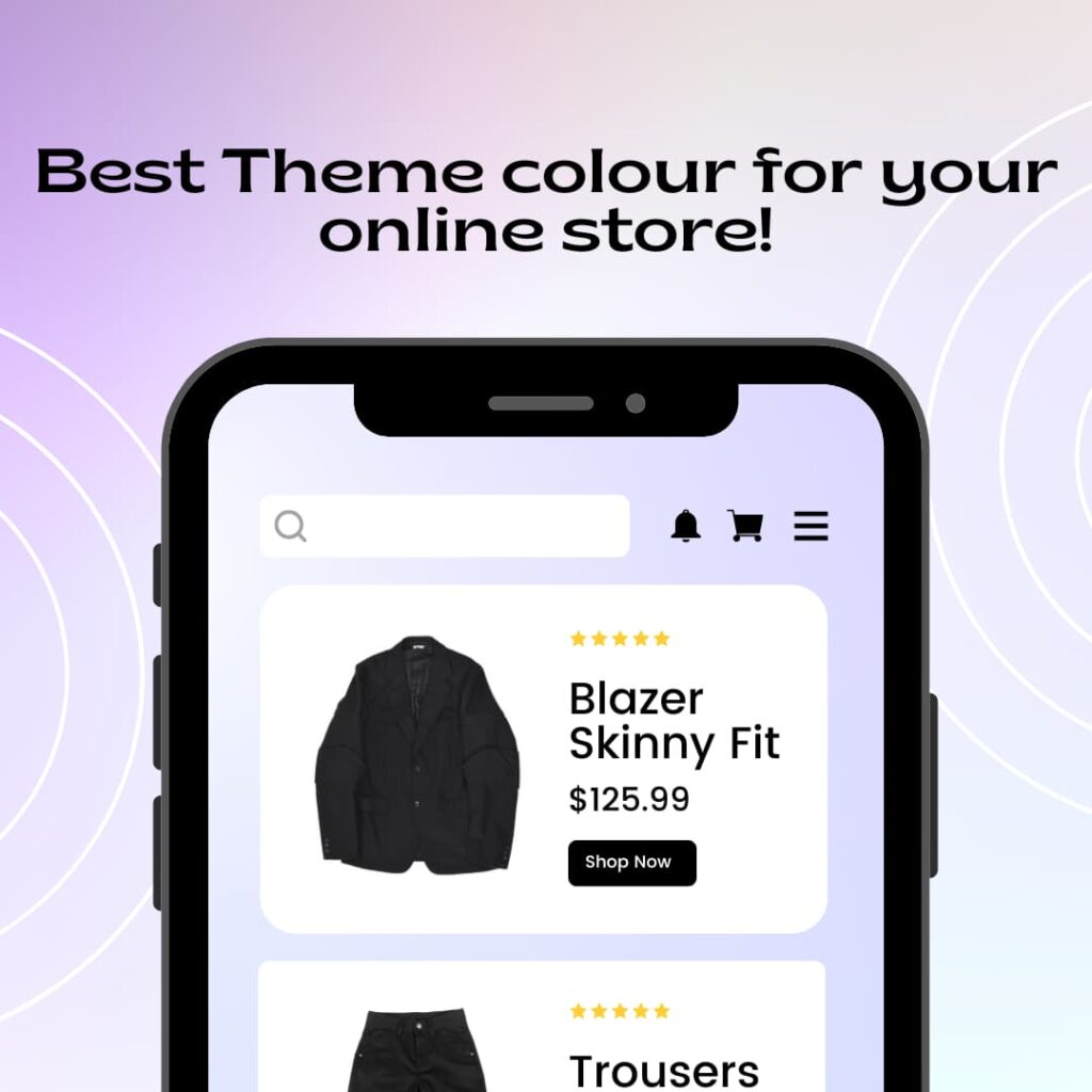
How to Choose the Best Theme Color for Your Online Store?
The selection of theme colors for your online shop directly impacts customer journey and brand identity alongside conversion ratio development. Studies suggest that 85% of consumers make purchase decisions based on color alone (Source: Colorcom). Picking the appropriate color scheme stands as a fundamental factor for achieving e-commerce achievement.
In this guide, I’ll share expert advice on How to Choose the Best Theme Color for Your Online Store, backed by psychology, case studies, and real-world examples.
1. Understand Color Psychology
Color psychology plays a massive role in consumer emotions and buying behavior. Here’s how different colors affect customer perception:
| Color | Meaning & Impact | Best Used For |
|---|---|---|
| 🔵 Blue | Trust, reliability, professionalism | Banks, tech, SaaS, corporate brands |
| 🟢 Green | Growth, freshness, eco-friendliness | Organic products, wellness, health |
| 🔴 Red | Urgency, excitement, passion | Sales, food industry, discounts |
| 🟡 Yellow | Optimism, happiness, energy | Kids’ products, food brands |
| 🟣 Purple | Luxury, creativity, sophistication | Beauty, fashion, premium brands |
| ⚫ Black | Elegance, power, exclusivity | High-end fashion, luxury items |
👉 Pro Tip: If you’re selling luxury items, go for black or deep purple. If your brand is about eco-friendly products, use shades of green to reinforce sustainability.
2. Align Color with Your Brand Identity
The chosen theme color should represent both your brand identity values together with its mission. Ask yourself:
- I want to spark specific emotions should customers experience when they enter my store.
- The combination I need to employ must reflect what competitors are doing and present unique aspects.
- My brand colors need to align with both my product identity and industry classification.
Case Study: Amazon vs. eBay
- Amazon adopts a color palette that consists of black and orange. The black color stands for reliability and professional quality yet orange produces both excitement and pressing messages.
- Through its red blue yellow and green color palette eBay presents a theme that stands for product diversity.
👉 Takeaway: Pick colors that reflect your branding strategy but remain differentiating compared to market competition.
3. Focus on Your Target Audience
Backgrounds containing different colors stimulate divergent responses across age groups and demographic distinctions along with cultural influences. For example:
- Audiences between 18 and 35 display positive engagement with red alongside vibrant oranges and intense neon colors.
- People from older demographics aged 45 and upwards choose pastel colors together with blue and gray and other more peaceful tones.
- The luxury market minimizes its color palette while selecting white black and gold as their primary choices.
Regional Preferences in Colors
Each cultural community developed its exclusive relationship with particular hues. For instance:
- In Westerners Culture white color for simplicity and purity but Asian associations view this color as a sign of sadness.
- In Chinese Culture red brings good fortune yet Westerners might associate it with Danger.
👉 Pro Tip: Make sure your global target market understands how your colors communicate because different cultures interpret them differently.
4. Test Different Color Combinations
Consistently using one color may yield ordinary design results. A combination of primary and secondary colors generates visual contrast which elevates your design. Some high-converting combinations are:
- Blue & Orange → Trust + Urgency (Great for SaaS & e-commerce)
- Black & Gold → Luxury + Prestige (Ideal for high-end fashion)
- Food brands should use the color combination of Red with Yellow to create energetic and happy branding.
- Green & White → Eco-friendliness + Purity (Best for health & wellness)
Additional Considerations for E-commerce UI/UX
- Your business should utilize a single color scheme that appears throughout website pages and product packaging and promotional materials.
- Standout Call to Action buttons must have contrasting elements with their background to provide maximum visibility.
- Check how colors display across various device platforms along with multiple screen resolutions.
Tool Recommendation
Online designers can benefit from free tools including Coolors.Co and Adobe Color Wheel to create professional color schemes for their stores.
5. A/B Test Your Theme Color
You should avoid guessing about color combinations because executing actual testing will reveal which scheme produces optimal customer engagement and purchase behavior. Surveys based on A/B testing show that certain color choices produce higher customer engagement levels and sales amounts.
How to A/B Test?
1. Build two identical website variations each with its color scheme.
2. The platforms Google Optimize and Optimizely enable you to monitor real-time user interactions within your website platform and application.
3. Track important performance indicators consisting of bounce rate together with time spent on site and conversion rates.
4. You should choose the color scheme that shows the most effective results in testing.
Example:
According to research from HubSpot, the replacement of a green Call to Action button with a red one resulted in a 21% increase in conversions.
👉 Takeaway: Your revenue potential doubles from changing one small color.
6. Ensure Accessibility & Readability
A color scheme that works efficiently for viewers also serves two dual purposes it delivers exceptional visual appearance while simultaneously meeting the requirements of color-blind users.
Best Practices:
✅ Maintain high contrast between text and background (e.g., black text on white background)
✅ Use color-blind friendly palettes (Check with Color Oracle Tool)
Using numerous dramatic colors will result in eyestrain for website visitors.
👉 Pro Tip: The WebAIM Contrast Checker enables users to examine their site readability to confirm ADA conformance.
Related Article That You Also Read :-
• What is the theme color of Home Shopping Spree
• Dropshipping Future in India
• Best indian Products for Dropshipping in 2025
• What is PLR Digital Products
• What is Master Resell Rights(MRR)
• What is DFY Digital Products in 2025
• 100+ Digital Products Ideas to Sell in 2025
FAQ on How to Choose the Best Theme Color for Your Online Store?
1. What is the best color for e-commerce websites?
There is no one-size-fits-all answer, but blue, green, and orange are widely used due to their trust-building and engagement-boosting effects.
2. How many colors should I use in my store’s theme?
Stick to 2-3 primary colors to maintain consistency and avoid visual clutter.
3. Can color impact sales and conversions?
Yes! Studies have shown that color can influence purchasing decisions by up to 85%, making it a critical factor in e-commerce success.
4. Should I use different colors for mobile and desktop versions?
Not necessarily, but always test how colors appear on different screens to ensure consistency.
5. What tools can help me choose the right color scheme?
Some great tools include Adobe Color, Coolors.co, and Canvas Color Palette Generator.
Conclusion
Your theme color defines your brand, impacts customer psychology, and ultimately affects your sales. Here’s a quick recap to help you decide: ✅ Align colors with brand identity (Luxury? Eco-friendly? Affordable?) ✅ Consider your target audience (Age, culture, and preferences matter) ✅ Test different color combinations (Use psychology-backed color pairings) ✅ A/B test before finalizing (Track conversions and engagement) ✅ Ensure readability & accessibility (Contrast matters!)
If you’re still unsure, use tools like Canva, Coolors.co, or Adobe Color to experiment with palettes before launching your store.